Thursday 24 April 2014

Evaluation Question Seven


We took into more consideration to ensure that our title was appropriate for our genre and our footage.
We used match on action in our actual film, as well as kept to the 180 degree rule.
I think that I have developed a lot from The Conspiracy to Remorse. I have learnt how to create more camera angles, as well as more information on films.

Thursday 17 April 2014

Evaluation Question Six

What have you learnt about technologies from the process of constructing the product?

During the filming and editing of Remorse, I have learnt how to use the Mac's and how to edit via iMovie. Prior to this project, I have never used either of them, so this was a big step. It was useful that we edited the preliminary task, as this gave me the opportunity to experiment with the software.
I have also learnt how to use blogger, and
Photoshop, to post my work on and to create the basic institutional logo.
 However to create the audio for our logo I used Serif MoviePlus X5 I have had past experiences with this software, hence why I chose to use it to make our animated version of our logo. But also for the Audio in the film.

Thursday 10 April 2014

Evaluation Question Five

How did you attract/address, your audience?

Our film attracts males aged between 15-30. I think that we have given our target audience what they are looking for. This is because they are looking for moderate violence and something to relate to, in this film, Schofield would be the person that they relate to.

Thursday 3 April 2014

Evaluation Question Four

Who would be the audience for your media product?

Our target audience, males aged between 15-30 years old. This is why the certification of our film is going to be 15. We will not change the certification to ensure our full target market will be watching the film.
As stated in my research and planning, I discussed that I would be using the uses and gratification model. The means that the audience is active instead of passive, in the Hypodermic needle theory.
 

Thursday 20 March 2014

Evaluation Question Two

How does your media product represent particular social groups?

We have tried to convey a sense of verisimilitude in our film opening, we have done this by attempting to look at most of the social groups.

Gender was shown in a positive and stereotypical way for the male character, as the male character is seen to be the most important character. However in the film the female is seen in a non-stereotypical way and negatively as she was the one whom betrayed Jake Schofield an killed his best friend
The way we use low angles also highlights Schofield's male dominance. 
The audience is meant to feel sorry for this character as he has just lost his best friend, Mark Hitching. However, we realise now that the storyline may have made the audience get mixed emotions about Schofield.
Our character was the only character being focused on, this is to show that he is not accepted by anyone else, and that he is now alone without Mark Hitching. 

We didn't really represent age as there was only one character in our film opening, and he was aged 27. To improve we would show a variety of characters that would represent their age.

Other social groups weren't really represented, this is because there was only one character in the film opening. 

Thursday 13 March 2014

Evalation Question One


As drama normally have a lot of verisimilitude, it means that we thought that our film opening should also have a sense of realism, this was done as we show the emotion of our actor, especially on the bridge and the bench.


The leaflet that I have created it on the bench because it shows continuity. The font and the style shows a sense of dismay and that the main character is fragile. This is the reason that I chose it, and faded it, this was to create emphasis that Jake Schofield is slowly fading away. 

This is the first time we see our character, this is because its the first time he can really reflect on  the death of his best friend, Mark Hitching. This is when de decides to let go of his past.


This picture shows that we took into consideration about mise en scene, and the positioning of the titles. This shot also shows that we filmed this on a dull day, we had done this because it connotes sadness.


We used transitions to smooth out each shot, this was because some of them seemed to drag on and bore the audience as the editing was slow paced. As seen here, we added a transition to help move the leaflet along the river.

Thursday 27 February 2014

Rough Cut Three


This is my rough cut three. I have shown this to my target market and, they said that we need to add audio, so for the final  film I will ensure that it includes audio.

Thursday 20 February 2014

Rough Cut Two


Feedback


  • 'Nice establishing shot but it is quite slow
  • Change the font of the titles – it Is not good
  • You need institutional logos at the start
  • Look at the placement of the film title – it is right on top *The shot where he walks across the screen with the lamppost in it is too long
  • Some of your shots are much better
  • Consider placement of other titles too – some of them are over the action
  • Consider sound track
  • The shot after he has thrown the leaflet away and the shot on the bridge is too far shot over to the right – it looks odd as he has just been in the centre of the frame
  • As an opening title sequence it runs well
  • Narrative is difficult to follow'
- Miss Peacock and Mr Bluck -


Thursday 13 February 2014

Rough Cut One


Feedback

  • 'You need an institutional logo - at least one at the start
  • You need at least another 30 seconds of footage
  • The notebook on the bench is not great
  • Your titles are not in the correct order - look at your research for this
  • The voice over is not good - there are gaps in it - will you add in non diegetic music?
  • The Film Title font and lavishness is bad - does not fit in with the genre
  • Some of the shots are out of focus and need to be filmed again
  • The narrative doesn't make sense - does he love him? who is it? I thought it was meant to be a gangster film - it feels like a love story at the moment.'

~ Miss Peacock and Mr Bluck ~

Thursday 6 February 2014

Filming Diary

Day One - 21st March 2014

On the first day of filming we ran into a major set back, the actor that we originally chose to be our actor wasn't able to make the day due to issues beyond our control. This meant that instead of not filming at all that day we decided that we would use Ryan, a member of Husky Productions to step in for actor, as he was the only person suitable to stand in for the actor as he knew how the character would act. This meant we could determine if the shots we were hoping to use were appropriate.
Another set back was that due to other members of  Husky Productions we had to start later than we planned due to traffic, this meant we could not start at exactly 4:30 as originally planned, however, since I had all the equipment needed, I had set up the camera and tripod ready to start as soon as Ryan and Peter had arrived, and waited patiently. 
As soon as they had arrived, we immediately started. Prior to this, we discussed that so Ryan could get marks for camera work, that he would film most of the establishing shots that didn't include him in it and Peter and I would shoot everything else.
Even with the delays, we managed to film every shot three times by our 6:00 deadline. This meant that we could films everything by the time it turned too dark.  

Day Two

Day two was the first day of editing. This involved choosing the appropriate clips and putting them into the right order. Unfortunately, as I was on a biology trip for the rest of that week, I wasn't able to help them complete the first rough cut. 

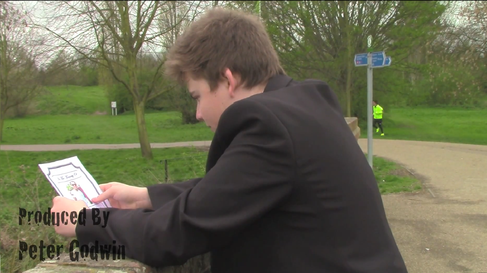
Day Three - 6th April 2014

On the second day of filming, we reshot everything again, this time with Alex, our actor. As we knew how we wanted it to look, and taking into consideration of the feed back we were given of the first rough cut, we were done in just a couple of hours. This meant that everything that we had shot, didn't need to be reshot, especially  because we had shot each scene three times. This day ran quite smoothly, even though there were minor traffic delays.

Day Four

We started editing the rough cut two, we made most of the improvements that we needed, as we added some shots, it made the clip also longer, this meant that we could cut other shots that were too long.

Day Five

For rough cut three, we all decided that I was going to edit this, as I hadn't edited the first rough cut, this let me move some of the titles around and lengthen or shorten clips to make it suitable, I also changed the font to a more suitable one and also added some audio in the background.

Day Six

For the final film cut, we decided that we were going to add the audio of Jake Schofield talking about Mark Hitching, his late best friend.

Thursday 30 January 2014

Husky Production Logo's

Husky Productions


This is the still image of the institutional logo that I have created, this is a picture of a husky in black and white, this gives the image a more huskier feeling and tone to the picture. This logo also helps identify the genre we are also making. There is a sense of mystery and grief in 'Remorse', this is shown through this logo.


 This is an animated version of my logo. I have created an animated logo due to Husky Productions being a mainstream production company. Mainstream companies like Husky Productions usually have animated logo that appears on their films. this will appear at the beginning of 'Remorse'.

Thursday 23 January 2014

Institiutional Logo

Universal


Universal is a subsidiary of NBC Universal. Their logo represents their mass distribution efforts around the world. This logo also appears to show the fact that Universal is an institution that is out of this world, shown through the fact that the word's Universal is shown floating in front of the world and in space. The letters are also written in  Silver and Gold colours, which may connote their success and wealth. Universal has also created an animated version of their logo, this includes sound. The sound gives it a royal tone to the animation, suggests that they see themselves as the best production company compared to all the rest.

Warner Bros.

Warner Bros. is a subsidiary of News Corporation. Their logo shows a blue and golden shield, the gold represents how wealthy, as well as how powerful and strong the institution is, where the blue connotes their royalty within the film institution.
Warner Bros. have also created an animated logo. This logo shows their studios which makes up the shield, this reinforces the fact that their studio's brings them their strength and without them, they wouldn't be where they are today. 


DreamWorks

DreamWorks was created by Steven Spielberg,  Jeffrey Katzenberg and David Geffen in 1994, they own 72% of this now. This forms the SKG embedded in the DreamWorks logo. The logo represents that the company creates it's audiences dream, meaning the best, films. This suggests that they fish through their audiences dreams and know what they want wants.
DreamWorks have also made an animated logo. This logo includes audio, this also reinforces the dream like structure that they represent.


These are all mainstream institutions, as Husky Productions is a mainstream production company, it means that we will ensure that we have a logo that represents our company but also the fact that we are a  mainstream institution, therefore we shall include sound and a form of animation in our logo.

Film4


Film4 is a British independent production company, it is owned by the Channel Four Television Corporation. Their logo is simple yet bright, this captures the audience's attention.
This is Film4's animated logo, as you can see it is very basic and doesn't contain animation, instead just light, blocks and a camera. It also doesn't include any audio.


Working Title

Working Title a subsidiary of Universal and Magnolia pictures. Their logo suggests that they are always working around the clock to produce the best films that appeal to their audience.
Working Title's animated logo reinforces my point above. The logo although, like Film4 doesn't have any audio.


These two production companies are independent productions this is shown through the lack of elaborate animation and audio.

Thursday 16 January 2014

Type of Production Company

The type of production company that Husky Productions will be is a mainstream one, this is because they are more associated with the type of genre that we are going to make for our film opening.
By being a mainstream production company also have a larger budget, this means that we can invest more in casting but also marketing of our film due to the disposable money.

Thursday 9 January 2014

Audience Attraction

My target audience will be attracted to my film because we will follow the generic conventions of the drama  genre. Husky Productions will ensure we stick to the traditional iconography and conventions of the genre to ensure that our target audiences watched our film.

Thursday 2 January 2014

Audience and Genre

Drama was one of the earliest forms of entertainment. 
The audience that watch the drama genre are both males and females, however this is also determined by the different sub genres. Female audience members usually watch romantic dramas, however, male audience members are most likely to watch a crime drama. This is generally because crime drama usually involves a lot of action, plot twists and betrayal of some sort. Most crime drama viewers are also in their late teens to early thirties.

Wednesday 1 January 2014

Reservoir Dogs Remake

My group, made of Peter Godwin and Ryan Chapman, and I have decided to do a remake because it will us gain more knowledge when it comes to acquiring the correct shot length, shot type and the order of each title that should appear on the screen.

Shot list

Black screen,
with directorial title blinking on screen
 10 seconds
Tracking longshot of protagonists
with actors name
   8 seconds
Mid-shot of a single protagonist,
with actors name
   5 seconds
Mid-shot of a single protagonist,
with actors name
   4 seconds
Mid-shot of a single protagonist,
with actors name
   3 seconds
Mid-shot of a single protagonist,
with actors name
   4 seconds
Mid-shot of a single protagonist,
with actors name
   3 seconds
Mid-shot of a single protagonist
with actors name
   3 seconds
Mid-shot of a single protagonist,
with actors name
   5 seconds
Mid-shot of a single protagonist,
with actors name
   5 seconds
Long shot of actors walking away from camera
    5 seconds until main title is introduced, another 6 until it fades and another 4 for the shot to end and turn to black
 15 seconds
 

3 actors names and 1 and the voice of’ credit scrolling up on the left (7 seconds)

Casting agent (5 seconds)

Music supervisor (5 seconds)

Costume designer (4 seconds)

Editor (3 seconds)

Production designer (5 seconds)

Director of photography (4 seconds)

Co-producer (4 seconds)

Executive producers (5 seconds)

Produced by (4 seconds)

(1min 48sec in total)


Location: normal street, to symbolise the gritty mood and tone that is established in the rest of the narrative.

 
By doing this shot list will help our group know how long each shot will have to be and what will appear on the screen and when.

Story Board

Timeline


This is our remake.


 This is the real Reservoir Dogs (1992)